
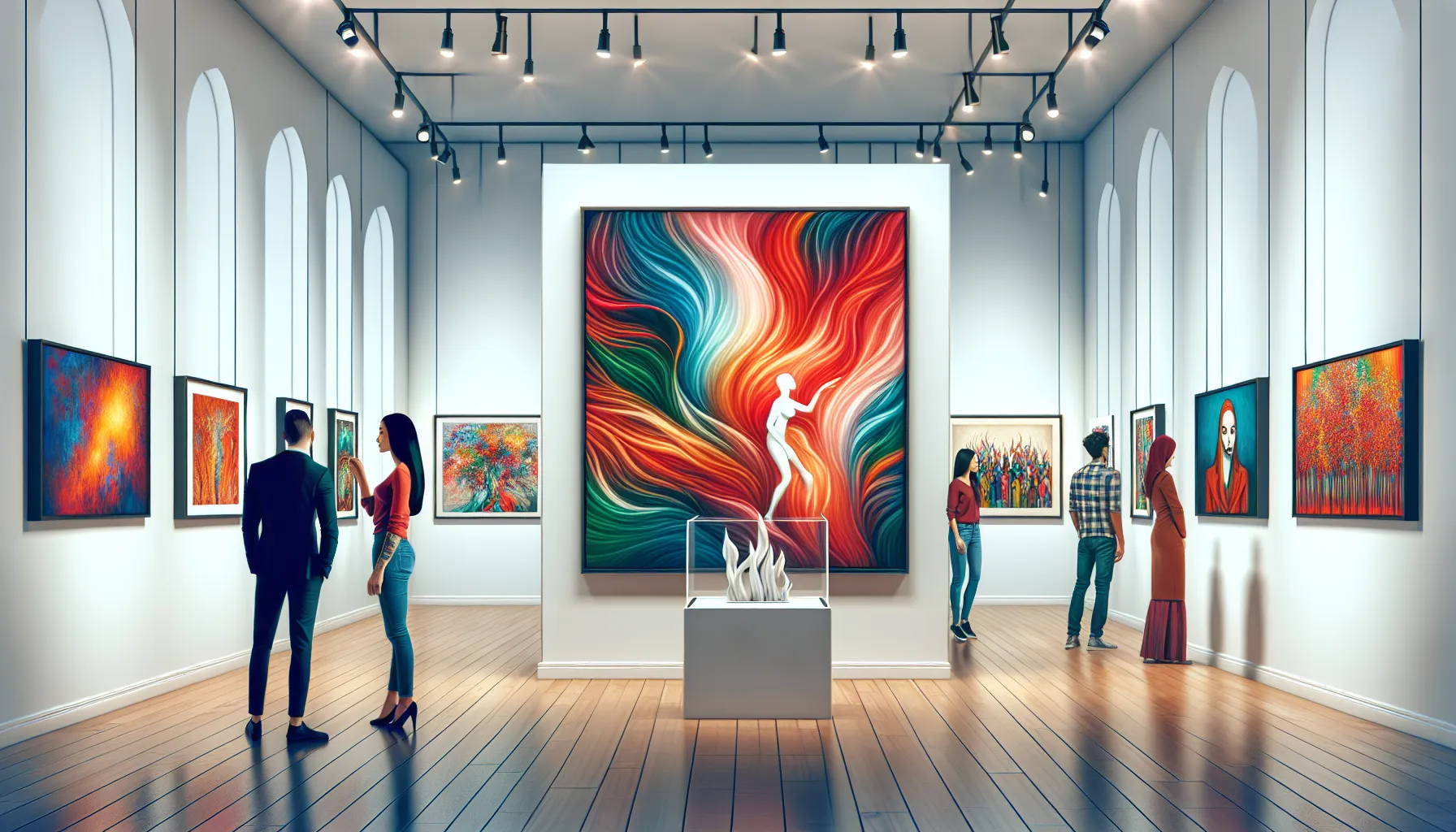
Walking into an art gallery, you’re immediately drawn to the pieces that catch your eye, but it’s the labels that guide your understanding and connection to the artwork. Art labels are more than just text—they’re your chance to provide context, tell a story, and enhance the viewer’s experience. Done right, they can transform how someone perceives and appreciates the art.
Whether you’re curating a professional exhibit or setting up a small gallery, knowing how to label art effectively is essential. From choosing the right font size to crafting concise descriptions, every detail matters. A well-designed label not only informs but also invites curiosity, making the artwork more accessible to your audience.
Importance Of Labeling Art In A Gallery
Effective labeling helps viewers understand the context and significance of artworks. Art labels provide essential details, such as the artist’s name, title, medium, and creation date, enhancing appreciation and comprehension. Without labels, visitors may miss critical historical or cultural connections.
Labels serve to highlight an artist’s intentions and inspirations. Clear descriptions can explain symbols, themes, or techniques, ensuring that even complex works are accessible to diverse audiences. For example, a brief explanation of abstract art can engage viewers unfamiliar with the style.
Proper labeling supports educational efforts in galleries. By including information about an artwork’s background or movement, you provide deeper insights that emphasize learning. Visitors, such as students, benefit from clear and concise text.
Consistent labeling strengthens a gallery’s professional image. Organized and standardized labels demonstrate attention to detail, creating a more polished and authoritative presentation. Standard formats make it easier for viewers to navigate exhibitions without confusion.
Accessible labels improve the inclusivity of your gallery. Use of appropriate font size, plain language, and multilingual options ensures that information reaches a broader audience, including international visitors and individuals with visual impairments.
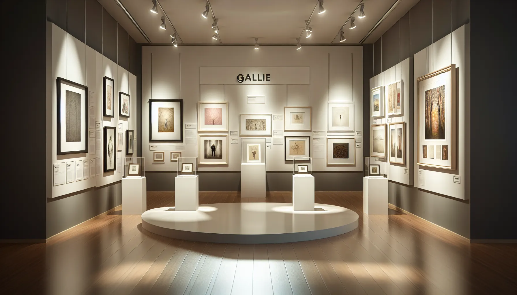
Key Elements Of An Effective Art Label
An effective art label offers the essential details visitors need to understand and appreciate the artwork. It balances brevity with clarity, ensuring readability and accessibility for diverse audiences.
Title Of The Artwork
The artwork’s title clarifies what the viewer is looking at. Place the title prominently and format it in italics or bold to distinguish it. For example, write Starry Night instead of plain text to give emphasis.
Artist’s Name And Background
Include the artist’s full name to attribute the work accurately. Optionally, add a short note about their cultural or artistic background, such as “Vincent van Gogh, a Dutch Post-Impressionist.”
Medium And Technique
Identify the materials used to create the art and the techniques applied. For example, “Oil on canvas” or “Mixed media on wood panel” informs viewers about the processes involved.
Dimensions Of The Artwork
Mention the artwork’s dimensions to help visitors visualize its scale. Provide the height and width in inches and centimeters, such as “24 x 36 inches (61 x 91 cm).”
Year Of Creation
Specify the year the work was created. If it spans multiple years, list the range, such as “1901–1904.” This detail offers historical context to the audience.
Additional Context Or Description
Provide relevant details about the piece, like its inspiration, historical significance, or the emotions it aims to convey. Avoid lengthy paragraphs, focusing instead on clear and concise explanations that enhance understanding.
Design And Formatting Tips For Art Labels
Effective art labels enhance the viewer’s engagement by delivering clear, accessible information. Attention to design and formatting ensures your labels leave a lasting impression.
Choosing The Right Font And Size
Select legible fonts like Sans-serif (e.g., Arial or Helvetica). Avoid decorative fonts that can compromise readability. Use a minimum font size of 16 points for body text to accommodate viewers from varying distances. Opt for bold or slightly larger text for headings such as the artwork title or artist’s name to create emphasis and hierarchy.
Ensuring Readability And Visual Balance
Maintain contrast between text and background using high-contrast color combinations like black text on a white background. Avoid using gradients or patterns that could distract from the content. Align text left for easy readability and limit text blocks to 50-75 characters per line. Keep spacing consistent, using sufficient margins and line spacing to avoid visual clutter.
Placement And Positioning In The Gallery
Mount labels at a height of 57–60 inches from the floor, aligning with average eye level. Place them to the right or directly below artwork to maintain visual association without obstructing the piece. Ensure spacing between the artwork and label allows visitors to focus on both elements without distraction.
Common Mistakes To Avoid In Art Labeling
Mistakes in art labeling can confuse or alienate visitors, diminishing their experience and reducing engagement with the artwork. Avoid these common pitfalls to ensure effective labels that add value to your gallery.
Overloading With Excessive Information
Including too much information on art labels overwhelms viewers and detracts from the artwork. Focus on essential details like the artist’s name, title, medium, and creation date. If additional context is needed, provide brief, concise descriptions or use supplementary materials, such as brochures or digital guides. Avoid long paragraphs and technical jargon that may confuse or disengage your audience.
Using Poor Quality Materials
Low-quality materials for art labels can negatively impact the gallery’s appearance and accessibility. Use durable, professional-grade materials resistant to wear, fading, and glare. Ensure the print quality is sharp and clear, with smudge-proof ink to maintain readability over time. Flimsy, faded, or poorly cut labels can distract visitors and undermine the gallery’s professional image.
Ignoring Accessibility Considerations
Labels that disregard accessibility limit their audience. Prioritize legible fonts like Sans-serif, a minimum font size of 16 points, and high-contrast color combinations for readability. Avoid using text that’s too small or blends into the background. Consider multilingual options for international visitors and tactile labels or audio guides for individuals with visual impairments. When labels aren’t accessible, they exclude essential segments of your audience.
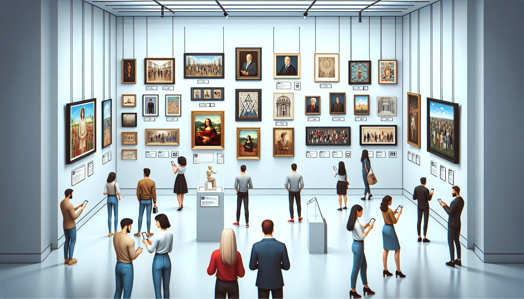
Trends And Innovations In Art Labeling
Adopting new trends in art labeling enhances audience engagement and keeps galleries relevant. Technological integration, sustainability, and personalized content define recent advancements in this field.
- Digital Labels
Incorporating digital displays allows dynamic presentation of information. You can include rotating content like artist interviews, video clips, or 3D renderings of the artwork. QR codes provide access to detailed online resources, enabling an interactive visitor experience.
- Sustainable Materials
Using sustainable materials reflects environmental responsibility. Recycled paper, biodegradable plastics, and renewable materials like bamboo are gaining traction for physical labels. These options also align with modern gallery values, appealing to eco-conscious visitors.
- Multilingual Labeling
Expanding language options supports global audiences. Digital or printed labels offering multiple languages make galleries more inclusive and accessible to international visitors while respecting cultural diversity.
- Augmented Reality (AR)
AR-enabled labels transform static experiences into immersive interactions. Visitors can use smartphones to view virtual overlays that share deeper insights, animations, or artist sketches, enriching their understanding of the artwork.
- Personalized Experiences
Customizable labeling systems cater to diverse audience preferences. Digital kiosks or mobile apps allow visitors to filter information according to interest levels, such as beginner, expert, or thematic content categories.
Galleries embracing these evolving practices enhance visitor engagement, accessibility, and sustainability, fostering deeper connections between art and audiences.
Conclusion
Art labels play a crucial role in shaping how visitors connect with and understand the artwork in your gallery. By focusing on clarity, accessibility, and thoughtful design, you can create labels that not only inform but also inspire and engage.
When you prioritize storytelling, professional presentation, and innovative approaches, your gallery becomes a space where art truly resonates with a diverse audience. Effective labeling is more than just a detail—it’s a powerful tool to enhance the overall visitor experience and elevate your gallery’s reputation.
Frequently Asked Questions
What is the purpose of art labels in galleries?
Art labels provide essential context and storytelling that help viewers understand, interpret, and appreciate artworks. They include details like the artist’s name, title, medium, and creation date, offering deeper insights into the artwork’s significance and the artist’s intentions.
What information should be included on an art label?
An art label should include the artwork’s title, the artist’s name and background, medium and technique used, dimensions, year of creation, and additional relevant context or description to enhance the viewer’s understanding.
What font size is best for art labels?
A minimum font size of 16 points is recommended for body text, with bold or slightly larger text for headings, ensuring readability for visitors, including those with visual impairments.
Why is multilingual labeling important?
Multilingual labeling ensures information is accessible to international visitors, enhancing inclusivity and allowing people from diverse linguistic backgrounds to engage with the artwork.
How does effective labeling benefit art galleries?
Effective labeling creates a professional image, enhances viewer engagement, supports educational efforts, and makes artwork more accessible to a broader audience, including those with visual impairments.
What common mistakes should galleries avoid in art labeling?
Galleries should avoid overloading labels with excessive information, using illegible fonts, employing poor-quality materials, and neglecting accessibility considerations, such as appropriate font sizes or multilingual options.
How can technology improve art labeling?
Technology like digital labels, QR codes, and AR (augmented reality) can provide interactive experiences, dynamic content, and detailed information while keeping physical labels concise and engaging.
How should art labels be positioned in a gallery?
Labels should be placed 57–60 inches from the floor for comfortable viewing and positioned close to the artwork without obstructing it, ensuring a clear visual association.
Why is sustainability important in art labeling?
Using sustainable materials like recycled paper or biodegradable plastics reflects environmental responsibility and appeals to eco-conscious visitors, aligning with modern sustainability goals.
What are the key visual design tips for art labels?
Art labels should use legible Sans-serif fonts, maintain high contrast between text and background, align text to the left, and limit text blocks to 50–75 characters per line for optimal readability.
Leave a Reply