If you’ve ever stood in front of a glowing Venetian canvas and then a crisply drawn Florentine fresco and felt they were speaking different dialects of the same language, you’ve already stepped into the debate: Venetian Color vs. Florentine Line. It’s the classic Renaissance argument, colore versus disegno, about where art’s true power comes from: radiant color, light, and atmosphere, or rigorous drawing, structure, and design. Understanding this rivalry doesn’t just sharpen your eye: it changes how you read paintings and how you see the choices artists make even today.
What the Debate Is About
Defining Disegno And Colore
In Renaissance terms, disegno means more than “drawing.” It’s conception, design, and the intellectual architecture behind a work, the skeleton that holds everything upright. Artists who prize disegno believe that form, proportion, and a disciplined line give art its truth.
Colore is color understood as sensation and structure at once. Venetian painters built form out of hue and light, letting tones fuse edges and letting the eye do the final blending. For them, color isn’t ornament: it’s the means of making flesh breathe and air feel humid or cool.
Why It Mattered In Renaissance Italy
This wasn’t an academic quarrel. Patronage, civic pride, and workshop training were on the line. The debate shaped how artists learned (drawing from the figure versus mixing glazes), how cities branded their artistic identities, and how viewers, like you, learned to value a painting. It also set the terms for centuries: when later artists took sides, they were often echoing Florence or Venice without saying so.
Roots And Rivalries In Renaissance Italy
Florence: Drawing, Design, And The Studio System
Florence trained its artists in drawing first: charcoal studies, silverpoint, anatomy, and perspective. Workshops emphasized cartoons (full-scale preparatory drawings) that transferred design to panel or wall. Fresco work, central to public life, rewarded speed, clarity, and linear control. In this culture, disegno stood for intellect and virtue, art as a moral geometry.
Venice: Light, Oil, And The Lagoon
Venice, surrounded by water and filtered light, leaned into oil paint on canvas. Canvas traveled well on boats, resisted humidity better than fresco, and welcomed slow, layered painting. Venetian painters chased the shimmer of fabric, the bloom of skin, and the haze of evening, qualities the lagoon offered every day. Color and atmosphere weren’t luxuries: they were the city’s native tongue.
Theorists Who Framed The Terms
Giorgio Vasari, a Florentine, elevated disegno as the father of all arts in his Lives, inevitably favoring Tuscan achievements. Venetian voices pushed back. Lodovico Dolce, in his Dialogue on Painting (1557), championed color and Titian, arguing that painting’s lifeblood is the effect on the eye. Between Vasari and Dolce, the terms hardened into camps, helpful for us, even if artists themselves often blended methods.
Artists As Case Studies
Florentine Exemplars: Botticelli, Leonardo, Michelangelo
Botticelli’s linear grace, think the elastic arabesques in The Birth of Venus (Uffizi), shows how line can carry poetry. Leonardo refines it: sfumato softens outlines, but his drawings and compositional scaffolding remain classical disegno: you feel the geometry under the mist. Michelangelo is disegno at full power: sculptural bodies, chiselled contours, figures that look carved even in paint.
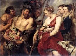
Venetian Masters: Bellini, Giorgione, Titian, Tintoretto
Giovanni Bellini builds sacred moods with slow, luminous oil: flesh seems lit from within. Giorgione dissolves stories in weather and music. Titian goes further, color as architecture. His late works, woven from broken strokes and glazes, prove that hue can model form as decisively as line. Tintoretto, meanwhile, marries Venetian glow to adrenaline: long, slashing brushwork, theatrical light, and daring perspectives.
Side-By-Side Comparisons Of Key Works
Compare Michelangelo’s Doni Tondo (Uffizi) with Titian’s Sacred and Profane Love (Galleria Borghese). The Florentine tondo is a marble-like knot of figures defined by contour and anatomical logic. Titian’s picture breathes: meanings slide with the light on skin and water. Or set Botticelli’s Primavera beside Giorgione’s The Tempest (Gallerie dell’Accademia): one is articulate allegory in line: the other, a poem whose subject is atmosphere itself. Even Leonardo’s sfumato in the Mona Lisa relies on drawing beneath the haze, while Titian’s late Pietà lets paint itself carry the emotion, edges yielding to darkness.
Technique, Materials, And Environment
Panel Vs. Canvas, Fresco Vs. Oil
Florentines favored panel and fresco, which reward clear contours and stable designs. Fresco fixes quickly on wet plaster: you commit to the line. Venice turned to canvas: lighter, flexible, cheaper in large formats, and ideal for oil’s leisurely drying time. That technical choice nudged artists toward coloristic solutions, glazing, scumbling, and revisions made in paint rather than in preparatory drawings.
Color, Light, And Atmosphere
Venetian color isn’t mere saturation. It’s optical: layered glazes that trap and release light, warm shadows, and cool highlights that feel like sea air. Florentine light tends to be clarifying, like daylight in a studio, built to reveal structure. When you sense damp air in a Titian landscape or the metallic gleam of a Tintoretto sky, that’s colore building a world you can almost smell.
Drawing, Underdrawing, And Workshop Practice
Under infrared, many Florentine works show detailed underdrawing, pounced cartoons, and corrections at the planning stage. Venetian canvases often reveal looser underpainting and changes executed in color. Workshop habits followed suit: Florentine apprentices drew from antique sculpture and live models incessantly: Venetians mixed pigments, learned to lay grounds, and understood how a cool gray underlayer could make a crimson glaze ignite.
Beyond The Renaissance: The Debate’s Afterlives
Baroque And The Academies: Poussin Vs. Rubens
In the 17th century, French academies essentially re-staged Venetian Color vs. Florentine Line as Poussin (design, reason, history) versus Rubens (color, sensation, vitality). Poussin’s choreographed figures and lucid compositions echo Florentine priorities: Rubens’s pulsing flesh and warm glazes revive Venetian sensuality. Critics built curricula around these poles.
Neoclassicism Vs. Romanticism: Ingres Vs. Delacroix
Ingres’s cool, immaculate line, see the taut contours in his portraits, defends disegno as the soul of painting. Delacroix counters with vibrating color and painterly handling that channel Titian and Rubens. Their duel in 19th‑century Paris made the old Italian argument newly urgent.
Modern Echoes In Impressionism And Abstraction
Impressionists, painting en plein air, inherit Venice’s love of optical color and atmosphere. Cézanne then rebuilds structure through patches of color, line without a line. In abstraction, you can feel both camps: Mondrian’s rectitude as a descendant of disegno: Rothko’s floating fields as heirs to colore’s immersive power. The debate never ended: it just changed clothes.
How To Look: A Viewer’s Guide
Questions To Ask When Comparing Works
- What carries the form, sharp contour or temperature shifts and value contrasts?
- Do edges harden or dissolve as they move through light? Where does the artist force your eye to focus?
- Can you sense layered glazes (depth, a slight inner glow), or does the paint sit flatter and read as graphic clarity?
Common Misreadings And Nuances
Don’t treat this as a binary quiz. Leonardo proves that disegno can breathe: Titian proves that color can build bone. Some Florentines, Fra Bartolommeo, for instance, discover soft modeling through color, while some Venetians draw fiercely under the paint. And remember context: altarpieces demanded legibility: private poesie invited mood. If you’re tempted to declare a winner, pause and ask what the painting’s purpose demanded.
Where To See Exemplary Works
To feel Florentine line, stand before Botticelli’s The Birth of Venus at the Uffizi and Michelangelo’s Doni Tondo nearby. For Venetian color, look at Titian’s later canvases, like the Pietà (Gallerie dell’Accademia), or the glow in Giovanni Bellini’s San Zaccaria Altarpiece (San Zaccaria, Venice). For the debate’s afterlives, compare Poussin and Rubens at the Louvre, or Ingres and Delacroix at the Musée d’Orsay. Online collections like the Uffizi Galleries and the National Gallery, London let you zoom in on edges and glazes so you can test your eye at home.
Conclusion
When you weigh Venetian Color vs. Florentine Line, you’re really asking how painting convinces: through the mind’s architecture or the eye’s chemistry. The best artists slip the rope and use both. Next time you’re in a gallery, track your attention, edge or atmosphere, contour or glow, and you’ll start hearing the old argument in stereo. That’s the pleasure of looking with intention: you don’t just see more: you understand why what you see works.
No responses yet